What this project is really about
Every major route planning tool works the same way. You enter a start point, a distance, maybe a bike type. The algorithm finds the most efficient path between the constraints. Then it offers you three variations of essentially the same route.
Cyclists don't want the fastest route. They want the right one for the kind of ride they're in the mood for. Existing tools — Komoot, Strava, Outdooractive, Wikiloc — are technically robust but treat personalization as secondary. None generate genuinely differentiated routes based on rider intent. The output of most planners is minor path variations, not meaningfully different ride experiences.
Designed an intent-to-route translation system: rider preferences (scenery, surface, shade, wind, safety) are converted into weighted routing constraints and processed through real environmental APIs. The result is a set of named route profiles, each representing a distinct ride intent, that produce genuinely different loops — not the same route with slight variations. Validated the system with 100+ real cyclists before a single screen was designed.
A functional vertical slice prototype using live APIs — OpenRouteService for routing and surface data, Shademap for time-based shade analysis, elevation processing for gradient metrics — proving the pipeline works with real data, not synthetic inputs. Competitive differentiation confirmed through Blue Ocean strategy analysis against Garmin, Komoot, and Strava.
A market full of tools, none of them personal.
Cyclists plan rides in two distinct settings. For familiar areas, they rely on memory and habit. For unfamiliar terrain — a new region, a travel destination, a route longer than their usual range — they turn to digital tools. This is where the planning gap lives.
What 116 cyclists actually told us.
We ran a survey of over 100 cyclists before sketching a single screen. This was not a formality. The survey results fundamentally shaped the direction of the project — and in one case, overturned an assumption we had walked in with.

Profiles over parameters.
After research, the question was not "what features should we build?" It was "what model of personalization would actually work for this context?"
The pipeline behind the profile.
The interface is simple. The system behind it is not. The design work that matters here is not the UI — it is the data architecture.
Two flows, real data, live APIs.
We designed two entry flows based on a consistent finding in the interviews: the difference between a rider who has 15 minutes and a rider who wants to spend an hour planning.
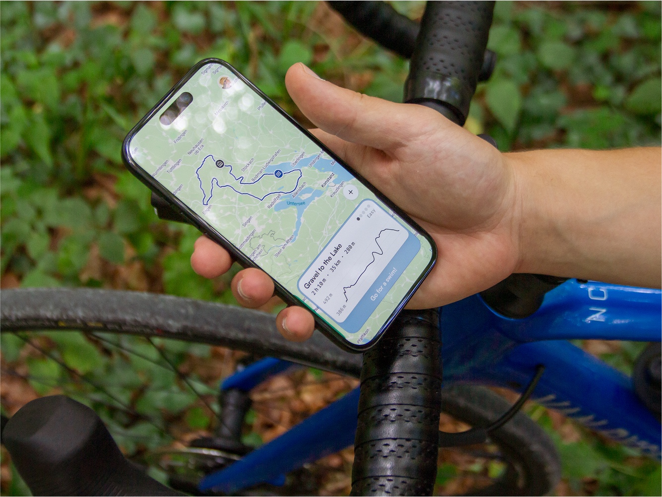
When the rider opens the app, they're greeted with three route profiles — each with one loop route, each built around a different set of metrics. Every day, each profile regenerates a fresh route against current conditions. Three profiles, three meaningfully different rides every morning. For the commuter cyclist with five minutes to decide, this is the flow.
Plan. Navigate. Improve.
The final product loop has three phases, designed as a continuous cycle rather than a one-shot experience.

What we validated.
The most important thing we validated was not the interface. It was the feasibility of the underlying system.

Control beats automation every time.
The clearest finding from our research — confirmed repeatedly through interviews — was that cyclists do not want the system to decide for them. They want to understand what the system is doing, adjust it, and trust the output because they can trace it back to their own preferences.
Explainability is the feature.
Personalization only works when users understand why the system made its recommendation. The pipeline is the product — the interface is how you make the pipeline legible.